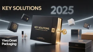
Choosing a design for your packaging can feel overwhelming. You see so many styles, but picking the wrong one can make your brand seem out of touch or fail to connect with your target audience, a costly mistake you can’t afford.
These trends directly influence buying decisions by dictating material choices, structural requirements, and printing techniques. Minimalist designs demand premium paper stocks, Neo-Vintage relies on textured materials, and Color-Blocking requires precise, high-fidelity printing to be effective.
I recently worked with a new direct-to-consumer fashion accessories brand. The founders were torn. One loved the clean, stark look of high-end tech packaging, another was drawn to the charming, illustrated boxes from an artisanal chocolate company, and the third wanted to use bright, bold colors to stand out on social media. They were stuck because they saw these as just "looks." I explained that each of these styles—Minimalism, Neo-Vintage, and Color-Blocking—is a complete communication strategy. Your choice isn’t just about aesthetics; it tells your customer who you are and what you value. It guides every decision we make together, from the feel of the paper to the type of printing we use. This shift in perspective helps them see their box not as a decoration, but as their most important marketing tool.
Does Minimalist Packaging Still Mean ‘Less is More’?
You want a premium look, but you’re worried a minimalist box will just look plain and boring. A simple white box might feel cheap, failing to communicate the quality of the product inside and getting lost in a sea of other packages.
Yes, but "less" now means "intentional." Modern minimalist packaging emphasizes premium, tactile materials, subtle finishes like debossing, and perfect structural construction. It’s about communicating quality through quiet confidence, not a lack of design.
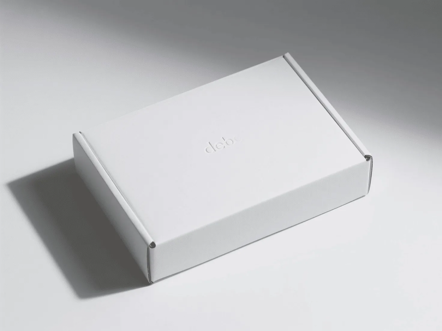
Minimalism has evolved beyond just being empty space. Today, it’s a sensory experience. When a client requests a minimalist design for their jewelry packaging or high-end cosmetics, the conversation immediately turns to materials. We’re not just choosing a color; we’re choosing a feeling. We discuss the difference between a standard coated paper and a thick, uncoated, toothy stock that feels substantial and organic in the hand. The focus shifts to finishing techniques that add elegance without shouting. A blind deboss (an impression without ink) or a subtle foil stamp in a matte finish can elevate a design from simple to sophisticated. Structurally, the box must be perfect. The corners must be sharp, the lid must fit with precision, and the form itself becomes a key design element. This approach tells the customer that the brand cares about every single detail, from the product itself to the box it comes in. It creates a powerful perception of quality and luxury.
Key Elements of Modern Minimalist Box Design
| Feature | Description | Impact on Buying Decision |
|---|---|---|
| Material Choice1 | Uncoated, textured paper stocks; thick-gauge paperboard. | Prioritizes paper mills with premium, tactile options. Higher material cost. |
| Finishing | Debossing, embossing, matte foil stamping, spot UV varnish. | Requires a manufacturer with advanced finishing capabilities. Adds to per-unit cost. |
| Color Palette2 | Monochromatic, muted earth tones, or stark black and white. | Focuses on ink consistency and material color matching over complex graphics. |
| Typography | Clean, sans-serif fonts; generous white space. | Printing must be exceptionally crisp, even at small sizes. |
Why is Neo-Vintage Design Making Such a Strong Comeback?
You’re drawn to vintage aesthetics but fear your packaging will look old-fashioned or gimmicky. A poorly executed "retro" design can make a high-quality, modern product seem dated, undermining its value and confusing your customers.
Neo-vintage succeeds by blending nostalgic elements—like custom illustrations and classic typography—with modern, clean layouts and high-quality production. It taps into a desire for authenticity and craftsmanship, making a brand feel both timeless and trustworthy.
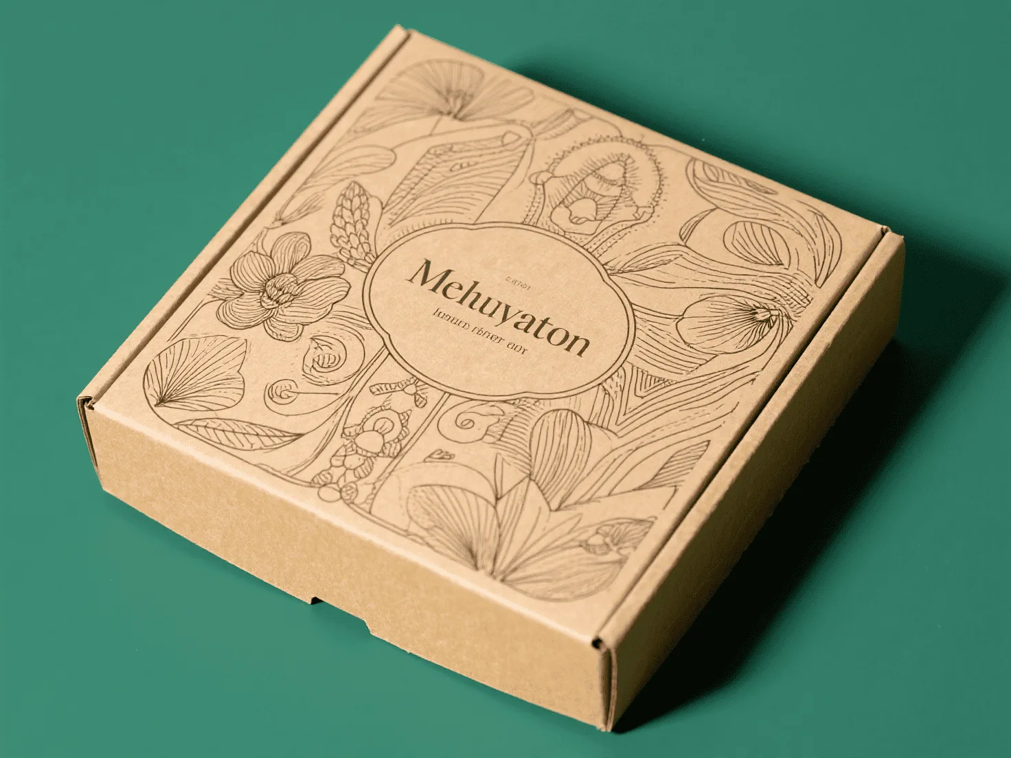
The appeal of neo-vintage is all about storytelling. It’s perfect for brands that want to convey a sense of heritage, artistry, or natural ingredients, even if the company is brand new. When I work on a neo-vintage project, for example for a food packaging client selling organic honey, our first step is to define the story. Are we evoking a 1920s apothecary, a mid-century general store, or a Victorian-era botanical print? This story dictates our choices. We often select materials like natural kraft paper or cream-colored textured stocks to give an instant feeling of authenticity. The printing process is key. We might use a simple one or two-color offset print to replicate older printing methods, but with modern precision. The artwork is central to this trend, often featuring detailed, hand-drawn illustrations or custom typography that feels unique to the brand. This isn’t about just copying an old design; it’s about taking the feeling of a bygone era and presenting it with the sharpness and quality that today’s consumer expects. It builds an emotional connection that a generic design simply can’t match.
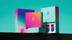
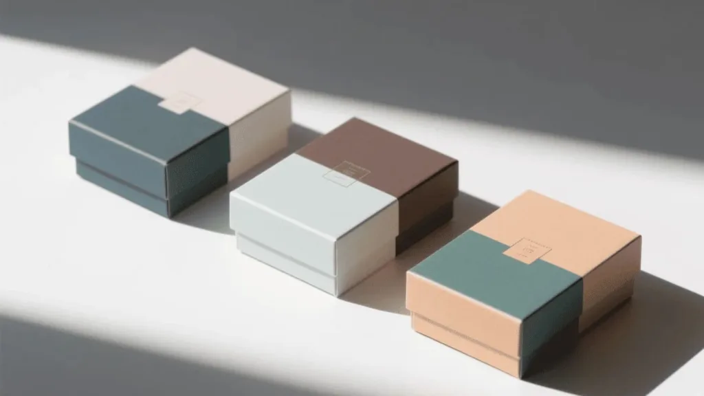
How Can Color-Blocking Make Your Product Instantly Stand Out?
You want your brand to be noticed, but you’re afraid that using bold colors will look unprofessional or garish. Playing it too safe with neutral colors can make your brand invisible on a crowded store shelf or in a fast-scrolling social media feed.
Color-blocking uses bold, contrasting fields of color in a deliberate, geometric way. It creates an energetic, confident, and modern identity that immediately grabs attention and makes your brand memorable, separating it from the competition.
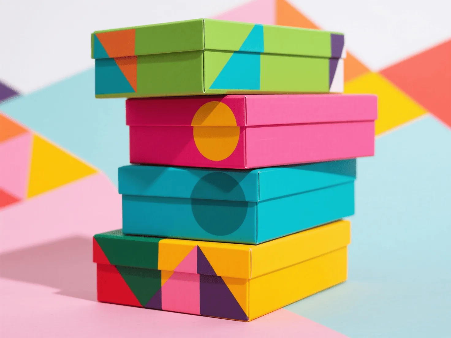
Color-blocking is a declaration of confidence. It’s a trend I see most often with direct-to-consumer brands in cosmetics, tech, and fashion who are targeting a younger, digitally native audience. For these clients, the custom paper box is a key part of their social media strategy. The goal is to create packaging that is "Instagrammable" right out of the shipping container. The buying decision here is almost entirely driven by printing capabilities. To achieve the saturated, perfectly uniform colors that this trend demands, high-quality offset printing is usually the best choice. The design relies on the interaction between two or three powerful colors, so color matching must be exact. The box structure is often quite simple—a standard mailer or lift-off lid box—because the colors are doing all the expressive work. We often discuss color psychology to ensure the chosen combination evokes the right emotion, whether it’s the energy of a neon pink and orange or the calm sophistication of a deep blue and mint green. This trend proves that you don’t need complex graphics to make a huge impact; you just need a fearless approach to color.
The Psychology of Color-Blocked Combinations
| Color Combination | Psychological Association | Best For… |
|---|---|---|
| Blue & Orange1 | Trust, calm (blue) with energy, friendliness (orange). | Tech startups, financial services, health & wellness brands. |
| Pink & Red | Playful, youthful (pink) with passion, excitement (red). | Cosmetics, confectionary, fashion-forward brands. |
| Black & Yellow2 | Sophistication, luxury (black) with optimism, attention (yellow). | High-end electronics, subscription boxes, bold lifestyle brands. |
| Green & Tan | Nature, health (green) with earthy, organic (tan). | Natural skincare, sustainable goods, gourmet food products. |
Conclusion
Minimalist, Neo-Vintage, and Color-Blocked designs are more than just fleeting styles; they are powerful tools that shape your brand’s identity. Understanding how they influence material, structural, and printing choices is the key to creating packaging that truly connects with your customers and elevates your product.
Ready to align your packaging with a design trend that tells your brand’s story? Contact us at Omet Packaging to explore the possibilities.
For more insights, read our guide on selecting eco-friendly materials that feel luxurious.
FAQ
Can I combine elements from different design trends?
Yes, absolutely. A popular approach is to use a minimalist structure with a pop of color-blocked detail on the interior, or to use a neo-vintage illustration style within a very clean, modern layout. The key is to do it intentionally so the final design feels cohesive, not confusing.
Which packaging trend is best for a luxury brand?
Minimalism is the traditional choice for luxury, as it emphasizes material quality and craftsmanship. However, a well-executed Neo-Vintage design can also convey luxury through a story of heritage and artisanal quality. The "best" trend depends on the specific story your luxury brand wants to tell.
How do these design trends affect the cost of my wholesale boxes?
Each trend impacts cost differently. Minimalism’s cost is often in premium paper stocks and special finishes (like debossing). Neo-Vintage costs can be influenced by custom illustration fees and the choice of textured paper. Color-blocking’s cost is tied to the quality of color printing required to achieve vibrant, consistent hues, often necessitating more expensive offset printing over simpler flexography.