How Do Luxury Finishes Make Cosmetic Boxes Look More Expensive?
Your cosmetic product is premium, but its packaging looks generic. On the shelf, it blends in, failing to communicate the quality within and getting overlooked by customers seeking a luxury experience.
Luxury finishes like foil stamping, embossing, and soft-touch coatings transform a standard paper box into a high-value sensory experience. They signal craftsmanship, quality, and exclusivity, directly increasing the product’s perceived worth and justifying a premium price point in the consumer’s mind. When paired with minimalist design and sustainable materials, these finishes can redefine luxury without relying on excessive packaging or unnecessary layers.
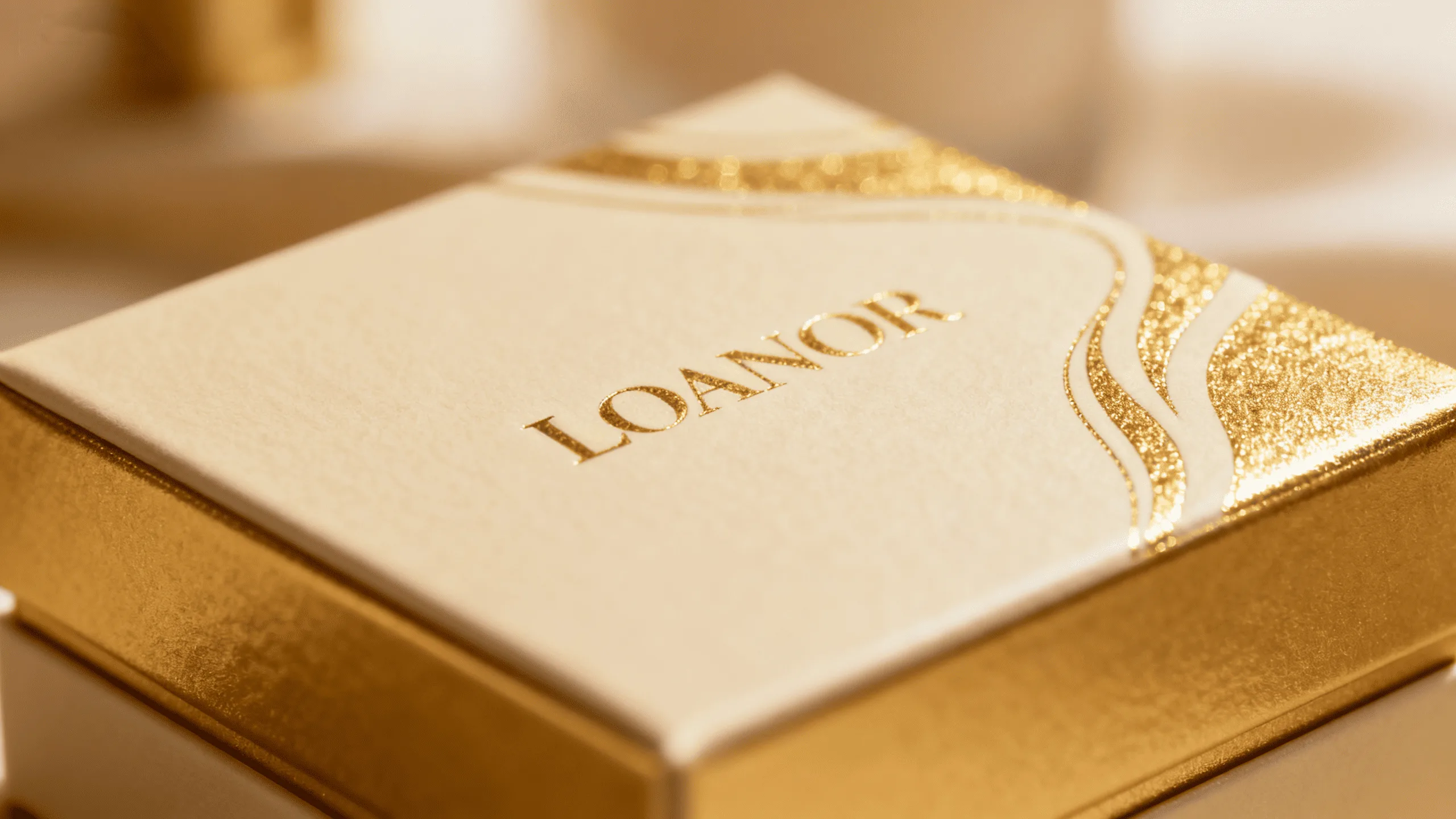
I’ve seen this happen time and again in my ten years in the packaging industry. A client develops a fantastic serum with high-quality ingredients, but they launch it in a basic printed box to save on initial costs. Sales are flat. The product is great, but the packaging tells a different story—one of being average. We once took a client’s existing box and made only two changes: we added a simple, elegant gold foil logo and applied a soft-touch matte lamination. The result? A significant uptick in retail sales and customer engagement. This isn’t magic; it’s the psychology of touch and sight.
At the same time, luxury doesn’t have to mean more material, more layers, or heavier packaging. Modern consumers increasingly associate premium products with thoughtful design, responsible materials, and intentional details. A small box made from high-quality textured paper with a precisely embossed logo can feel more luxurious than an oversized package filled with unnecessary plastic inserts. The right finish makes the packaging an active part of the product’s promise, telling the customer, "What’s inside is just as special as the box you’re holding."
How does foil stamping make a cosmetic box look more expensive?
Your product gets lost in a sea of competitors on a brightly lit retail shelf. It doesn’t catch the light, fails to draw the eye, and ultimately, doesn’t make it into the customer’s shopping basket.
Foil stamping adds a metallic or pigmented finish that reflects light, creating a powerful visual cue of luxury and expense. This flash of shine immediately captures attention, making the product stand out and feel more exclusive.
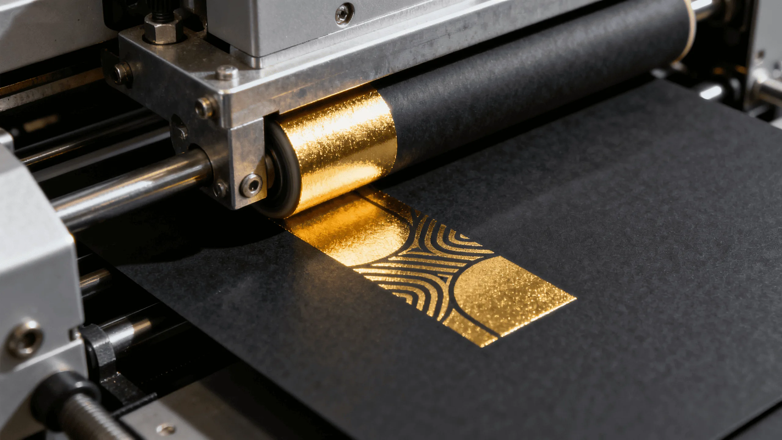
The power of foil is rooted in deep-seated human psychology. For centuries, reflective materials like gold and silver have been associated with wealth, rarity, and high status. When a customer sees that flash of metallic light on a cosmetic box, it triggers a subconscious connection to these concepts. It signals that the product is not ordinary. In the fast-paced retail environment, foil stamping is a strategic tool to interrupt a customer’s scanning gaze. It creates a point of focus.
I always advise my cosmetic brand clients to use foil strategically on key elements like the brand logo, product name, or a unique pattern. The color choice is also critical. Gold foil often conveys classic luxury and anti-aging properties, silver can suggest a clean, clinical, or scientific formulation, while rose gold appeals to a modern, trend-conscious demographic.
The Psychology of Shine
Foil’s reflective quality1 does more than just look pretty; it communicates value. The brain associates shiny, metallic surfaces with precision and quality manufacturing, leading customers to assume the product inside is made with similar care. It’s a non-verbal promise of excellence.
Smart Application
Overusing foil can make a design look gaudy. The most effective applications are often the most restrained—a crisply stamped logo or a delicate border. This subtlety suggests a quiet confidence2 in the brand’s quality, which discerning customers appreciate.
This restrained approach is also important for sustainable luxury. Instead of covering the entire box with decorative effects, brands can use one small foil detail against a premium paper stock. This allows the material, structure, and finish to work together without adding unnecessary packaging layers.
What role does embossing play in creating a tactile brand experience?
A customer picks up your box, but it feels flat and lifeless. The interaction is brief and forgettable. There is no physical connection to your brand, no reason for them to hold on and consider the purchase further.
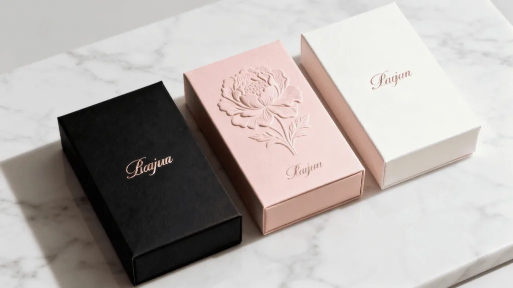
Embossing (raising a design) and its counterpart, debossing (indenting a design), create a three-dimensional surface that invites touch. This tactile engagement makes the brand more memorable and conveys a sense of detailed craftsmanship and superior quality.

In an increasingly digital world, the power of touch is more significant than ever. When a customer runs their fingers over a raised logo or a subtly textured pattern on a cosmetic box, it creates a haptic—or touch-based—memory. This physical interaction is far more powerful and lasting than a purely visual one. It slows the customer down, encouraging them to spend more time with your product in their hands.
An embossed detail suggests investment and care. It tells the customer that the brand didn’t cut corners; they invested in details that most companies skip. A "blind emboss," where a design is raised without any ink or foil, is a particularly powerful signal of understated luxury. It is also an excellent example of how sustainable minimalism can still feel premium: the effect comes from the paper itself and the precision of the manufacturing process rather than from an additional decorative material.
Building Brand Memory
The physical sensation of an embossed logo1 can become a signature for your brand. Regular customers will begin to recognize your product by feel, creating a deeper level of brand loyalty that goes beyond just visual recognition.
Conveying Quality
The crisp, clean edges of a well-executed emboss require high-quality paper stock and expert manufacturing. This detail subconsciously communicates to the customer that the product is likely made from high-quality materials2 and with the same attention to detail.
For brands pursuing sustainable luxury, this principle is particularly valuable. Rather than relying on multiple layers, plastic inserts, or excessive decoration, you can invest in a substantial, textured, recycled or responsibly sourced paper stock and let the material itself become part of the luxury experience.
Your packaging feels like standard, generic cardboard. The texture does nothing to reflect the smooth, silky, or hydrating promise of the cream or serum inside. This creates a sensory disconnect that undermines your product’s marketing message.
A soft-touch finish provides a velvety, matte texture that feels uniquely luxurious and pleasant to hold. This premium tactile sensation slows down the customer’s interaction, creating a perception of higher quality and reinforcing the product’s promise of a smooth application.
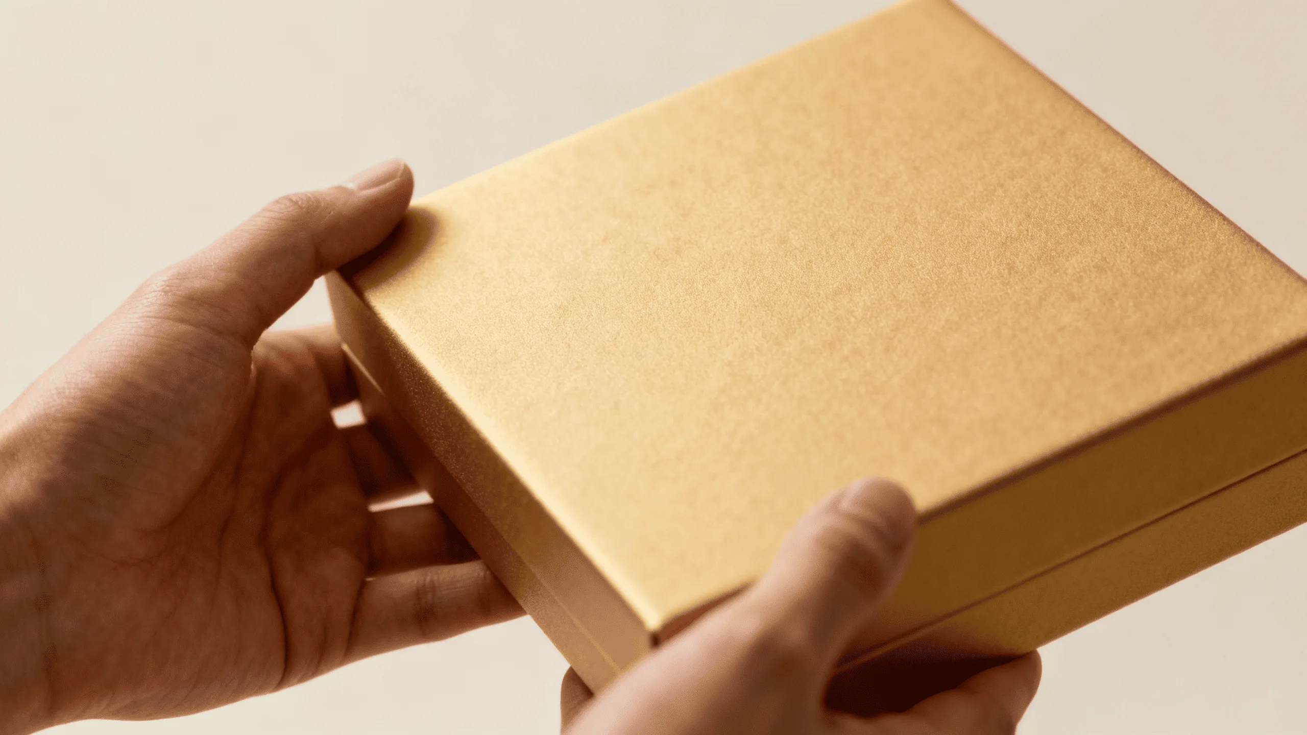
The effectiveness of a soft-touch finish lies in a principle I call "sensory congruence." This means the feel of the packaging should align with the promised benefit of the product. When a customer is buying a foundation that promises a "flawless, smooth finish," and the box itself feels flawlessly smooth and velvety, it validates the product’s claim before it’s even been opened. This alignment builds instant trust and makes the marketing message more believable.
A soft-touch lamination or coating has a low-sheen, matte appearance that absorbs light, making colors appear richer and deeper. This creates a visually sophisticated and modern look that stands out from standard glossy finishes. From a practical standpoint, it can also help resist fingerprints, ensuring the package looks pristine on the shelf and in the customer’s home.
For sustainable brands, however, the finish should be selected as part of the entire packaging system rather than treated as an isolated decoration. Where appropriate, brands can explore recyclable or lower-impact coating options, while keeping the overall construction simple and avoiding unnecessary mixed materials.
Comparing Common Laminate Finishes
Choosing the right finish depends on your brand identity and the product’s function. Here is a simple breakdown to guide your decision:
| Finish Type | Tactile Feel | Brand Association | Best For Products That Are… |
|---|---|---|---|
| Soft-Touch1 | Velvety, smooth, suede-like | Modern Luxury, Gentle, Premium | Serums, foundations, moisturizers |
| Matte Lamination2 | Smooth, non-reflective, flat | Sophisticated, Understated, Clean | Skincare, minimalist makeup lines |
| Gloss Lamination | Shiny, slick, reflective | Vibrant, Bold, Eye-catching | Lip gloss, highlighters, colorful palettes |
How can minimalist packaging make luxury cosmetics more sustainable?
You may assume that premium cosmetic packaging needs to be heavy, oversized, and built with multiple layers. But this traditional approach can create unnecessary material use, shipping weight, and recycling challenges.
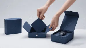
Minimalist packaging can deliver a premium experience while reducing waste when it combines intelligent structural design, high-quality paper materials, and carefully selected finishes. Luxury shifts from excess to precision: less material, but better materials and better execution.
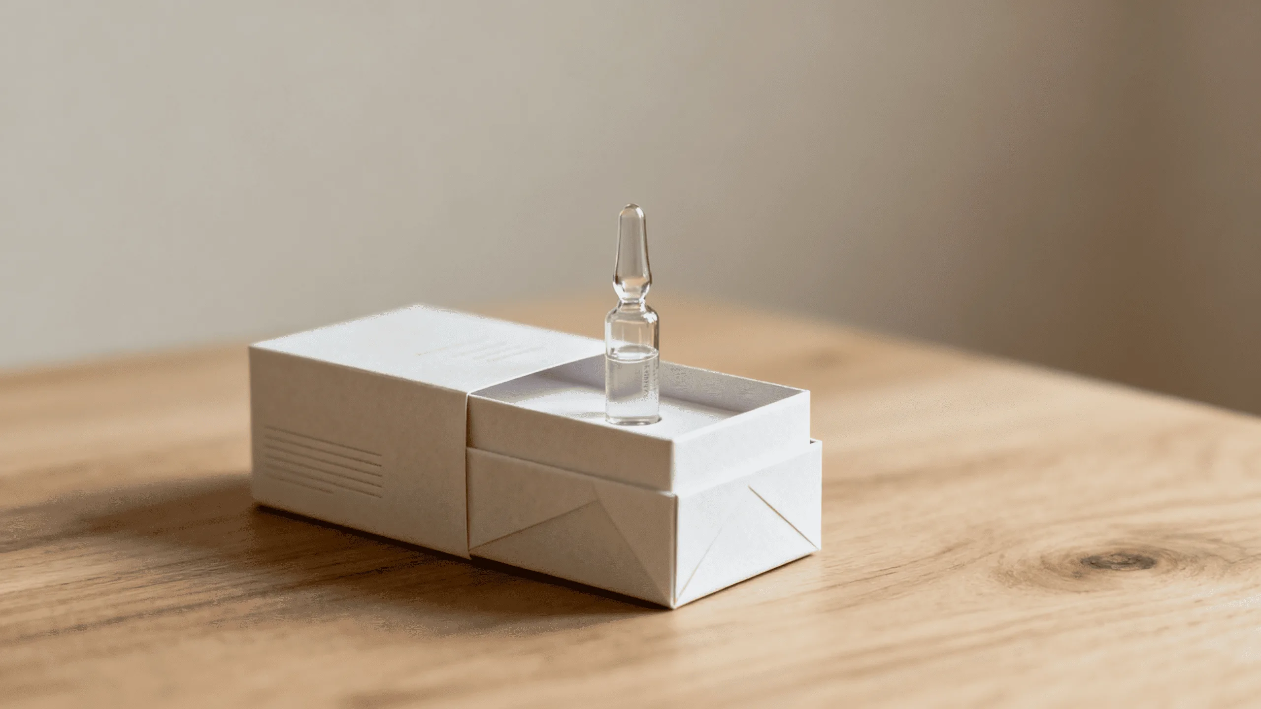
The modern definition of luxury is changing. Instead of equating value with weight and excess, many consumers now appreciate quiet confidence, responsible sourcing, and intelligent design. A smaller box made from substantial textured paper, with a clean layout and a precise blind emboss, can feel more premium than a complicated box-in-box construction filled with plastic inserts.
The goal is not simply to remove materials. It is to use the budget more intelligently. Savings from eliminating unnecessary layers can be redirected toward higher-grade paper, better structural engineering, or one carefully chosen finish. This creates a package that looks intentional rather than inexpensive.
Comparing Traditional and Minimalist Luxury
| Traditional Luxury Cue | Minimalist Luxury Cue | What It Communicates |
|---|---|---|
| Multiple Layers (Box-in-a-box) | Smart Structural Design | Intelligence, efficiency, reduced waste |
| Heavy Glass & Plastic Jars | High-Quality, Textured Paper Stock | Natural quality, conscious choice, tactile appeal |
| Ornate, Colorful Graphics | Crisp Typography & White Space | Confidence, clarity, sophistication |
| Multiple Decorative Effects | One or Two Strategic Finishes | Understated elegance, craftsmanship |
| Oversized Packaging | Right-Sized Paper Packaging | Efficiency, intentionality, reduced material use |
The Mono-Material Advantage
One of the biggest obstacles to recycling is the combination of incompatible materials. Plastic laminates, magnets, foam inserts, and other components can make recycling more difficult. Wherever product protection and technical requirements allow, a paper and paperboard-focused construction can simplify the packaging system and improve recyclability.
This makes minimalist design more than an aesthetic choice. It can become part of a broader sustainability strategy that reduces material consumption while preserving the premium appearance customers expect.
Measuring the Impact
The benefits can be tracked through practical KPIs such as grams of packaging per unit sold, packaging weight per shipment, units per pallet, and the percentage of packaging that is recyclable. These measurements allow sustainability improvements to be evaluated alongside commercial performance rather than treated as purely marketing claims.
What are monodose paper packages and when should cosmetic brands use them?
Samples, travel products, and targeted treatments are increasingly important in beauty. But traditional single-use formats often rely on plastic sachets or complex multilayer materials that conflict with a brand’s sustainability goals.
Monodose, or single-dose, paper-based packaging can provide a convenient and hygienic format for products such as serums, masks, and treatments while reducing product waste and, where suitable barrier technologies are used, offering a more recyclable alternative to conventional plastic-heavy formats.
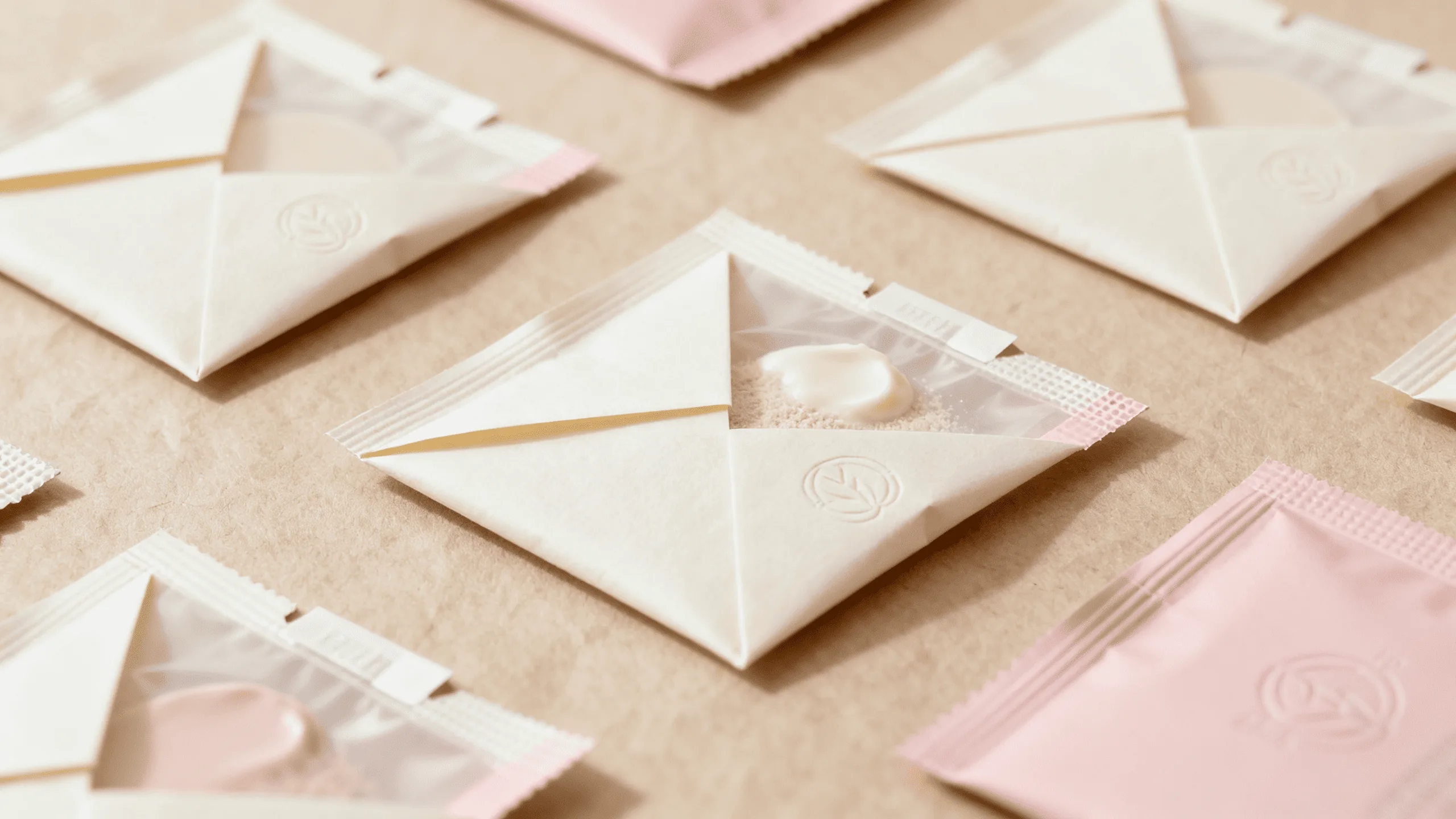
Monodose packaging offers several functional advantages. A single-use format provides a fresh application each time, which can be valuable for products where hygiene is important. It can also help protect sensitive formulations from repeated exposure to air and contamination. For consumers, it is lightweight, travel-friendly, and dispenses a controlled amount, reducing the likelihood of unused product being left in a larger container.
The sustainability opportunity comes from material innovation. Paper-based sachets1 and molded paper or pulp components are expanding the possibilities for brands that want to reduce reliance on conventional plastic packaging. However, the exact recyclability of a monodose package depends on its barrier coating, construction, local recycling infrastructure, and the formulation it must protect.
Beyond the Sample
Monodose formats are not limited to free samples. They can support subscription boxes, advent calendars, travel kits, targeted treatment programs, and curated skincare routines. This gives brands a way to introduce multiple products or treatments without requiring consumers to purchase several full-size containers.
How do these finishes combine to justify a higher price point?
You see these luxury finishes as individual costs that add up, making you hesitant to invest. You’re not sure if combining them will truly deliver a return, and you struggle to explain the value to your finance team.
Combining finishes creates a multi-sensory hierarchy of value. The interplay between a visual element like foil and a tactile one like embossing creates a sophisticated, layered experience that signals exceptional quality, while minimalist structural design prevents the overall package from becoming excessive.
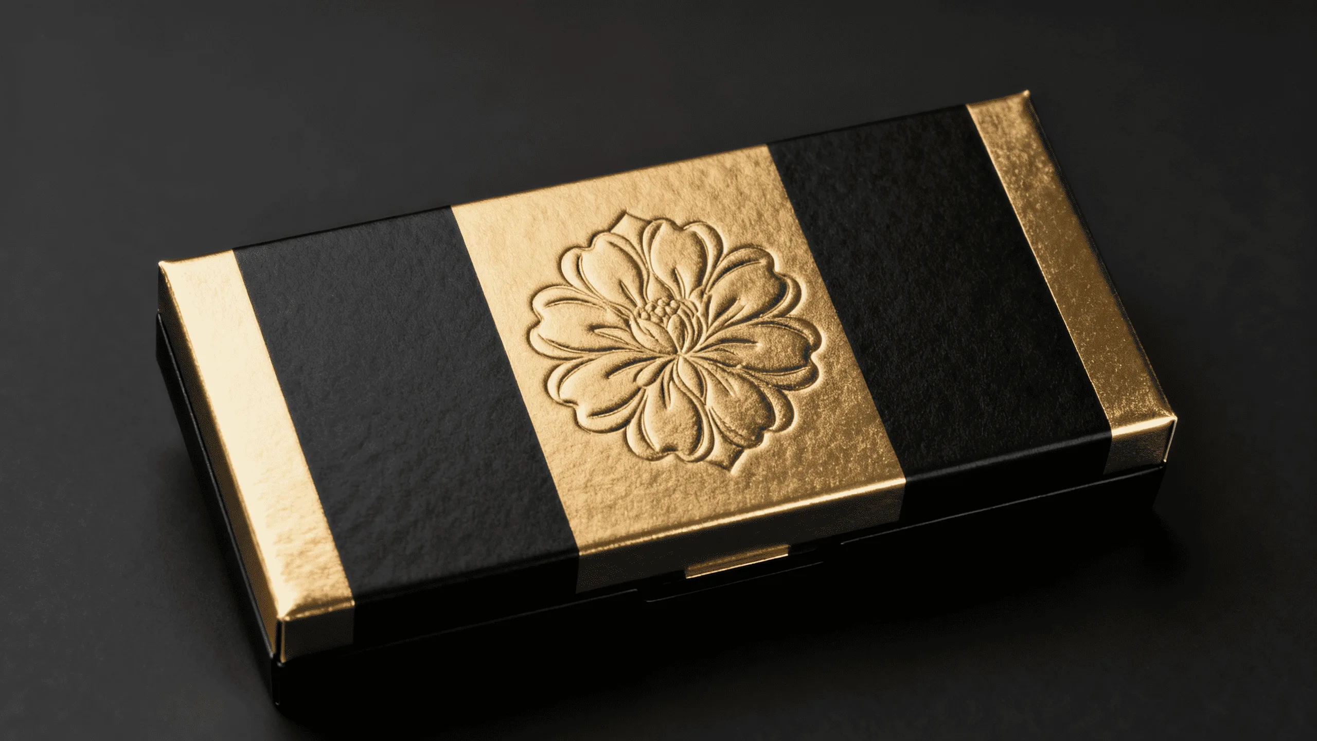
The true power of luxury finishes is unlocked when they are used in combination. Imagine a customer picking up a box with a soft-touch finish. Their first impression is one of smooth, gentle quality. As they look closer, their eye catches the bright gleam of a gold foil logo. Then, as they run their thumb over it, they feel the raised, crisp edges of an emboss. In just a few seconds, you have engaged their sense of touch and sight, with each interaction reinforcing the last.
But more finishes do not automatically mean more luxury. The strongest premium packaging often uses a restrained combination: perhaps a textured paper stock, a blind emboss, and one small foil detail. This "less but better" approach creates visual hierarchy while reducing the need for excessive decorative elements and additional packaging layers.
The result is a package that feels considered and expensive without appearing wasteful. It transforms the unboxing from a simple action into a memorable ritual and turns packaging into a marketing asset. The experience can encourage customers to photograph and share the product, extending the packaging’s value beyond the moment of purchase.
The ROI of Sensory Appeal
Investing extra money in a carefully selected foil and emboss combination can increase perceived value far beyond the actual cost of the finishes. The key is not to maximize the number of effects, but to identify the one or two details that most effectively communicate your brand’s positioning.
At the same time, a minimalist structural design can offset some material and logistics costs. A smaller, lighter box can reduce packaging weight, improve pallet efficiency, and lower shipping costs, creating another potential source of return.
Creating a Brand Signature
A unique combination of finishes can become a recognizable signature for your brand. When customers see that specific mix of texture and shine, they will instantly associate it with your brand’s quality and aesthetic, building long-term brand equity1.
How do you market sustainable luxury without making the packaging look cheap?
You may create a minimalist, sustainable package but worry that customers will interpret the simplicity as cost-cutting rather than intentional design.
The key is to frame minimalism as "conscious luxury." Use on-pack messaging, QR codes, and digital content to explain that the packaging is deliberately designed to prioritize quality, efficiency, and sustainability over unnecessary excess.
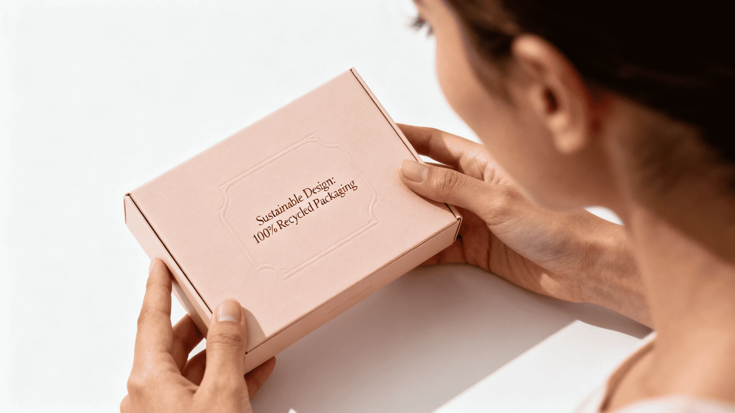
You cannot expect the customer to connect the dots on their own. The story begins on the box itself. A simple line such as "Designed with less material, without compromising protection" can reframe the package as a conscious design choice rather than a cheaper alternative.
Small details can reinforce the story. Depending on the actual specifications of your packaging, messages such as "Recyclable Paper-Based Packaging," "Printed with Soy Inks," or "FSC-Certified Paper" can communicate responsible choices. These claims should only be used when they are accurate and supported by the relevant materials or certifications.
A QR code can take the story further, linking to a page that explains your packaging philosophy, material sourcing, structural design, and waste-reduction efforts. Showing customers why you chose a smaller box, textured recycled paper, or a blind emboss helps turn simplicity into a deliberate brand statement.
This approach creates what can be called "conscious luxury": the product feels premium not because it contains more packaging, but because every packaging decision has a purpose.
On-Pack Messaging is Key
Even the smallest message can have a big impact. Clear statements about recyclable materials, responsible sourcing, or reduced material use can help customers understand the thinking behind a minimalist package.
The Digital Deep Dive
Use your digital channels to go deeper. A blog post detailing your journey to find the right sustainable paper, or an Instagram Reel showing the smart folding design of your box, can make customers feel like insiders and strengthen their connection to your brand.
Conclusion
Luxury finishes are not mere decorations, and sustainable minimalism is not a compromise on luxury. Together, they represent a more intelligent approach to premium cosmetic packaging. Foil, embossing, soft-touch coatings, high-quality paper stocks, and thoughtful structural design can engage the senses while eliminating unnecessary layers and materials.
The strongest packaging strategy is not to add more simply because the product is expensive. It is to make every detail count. A right-sized paper box, premium tactile stock, one carefully selected finish, and a transparent sustainability story can create a sophisticated experience that feels intentional, memorable, and responsible.
For brands offering samples, travel products, or targeted treatments, monodose paper-based formats can extend this philosophy further by combining convenience, hygiene, controlled product use, and potentially improved recyclability where the construction is appropriately designed.
The future of luxury packaging is not about excess. It is about intelligent design, exceptional materials, sensory detail, and conscious choices.
Ready to redefine luxury for your brand? Explore our custom cosmetic packaging solutions or contact us today for a personalized consultation.
FAQ
Are luxury finishes eco-friendly?
Many are. Modern advancements include recyclable foils and water-based, soft-touch coatings. A "blind emboss" uses no additional decorative material, only pressure. However, the overall recyclability of a package depends on the complete construction, including coatings, laminations, inserts, and other components. At Omet Packaging, we can help you select finishes and materials that align with your brand’s environmental goals.
What is the most cost-effective luxury finish to start with?
A simple, well-placed foil stamp on a logo or product name often delivers the highest visual impact for the investment. A blind emboss is another strong option for brands seeking understated luxury with minimal additional material. The best choice depends on your paper stock, design, target price point, and desired brand image.
How do I choose the right finish for my brand’s identity?
Consider your brand’s personality. Is it modern and minimalist? A blind emboss on textured or matte stock might be perfect. Is it glamorous and bold? A high-shine gold foil can create a stronger visual impact. For skincare brands focused on conscious luxury, premium textured paper combined with restrained finishes can communicate sophistication without excessive decoration.
Can minimalist packaging really look luxurious?
Absolutely. Luxury minimalism relies on superior materials, precise construction, typography, structural details, and restrained finishes rather than excessive layers. A substantial textured paper stock, clean design, and perfectly executed emboss can feel more premium than an overly complicated package.
Is monodose paper packaging more sustainable than traditional cosmetic packaging?
It can be, depending on the materials and construction. Paper-based monodose formats can reduce reliance on conventional plastic-heavy packaging and may be recyclable when designed with appropriate coatings and compatible materials. They can also reduce product waste by delivering a controlled single-use amount. Brands should evaluate the complete package and local recycling conditions rather than assuming that any package labeled "paper" is automatically recyclable.
Can paper packaging adequately protect sensitive cosmetic formulations?
Yes, when properly engineered. Modern paper and paperboard packaging can incorporate specialized barrier coatings and structures designed to protect against moisture, oxygen, and light. For sensitive formulations and monodose applications, the packaging must be tested against the specific product and required shelf life to ensure adequate protection while maintaining the desired sustainability characteristics.