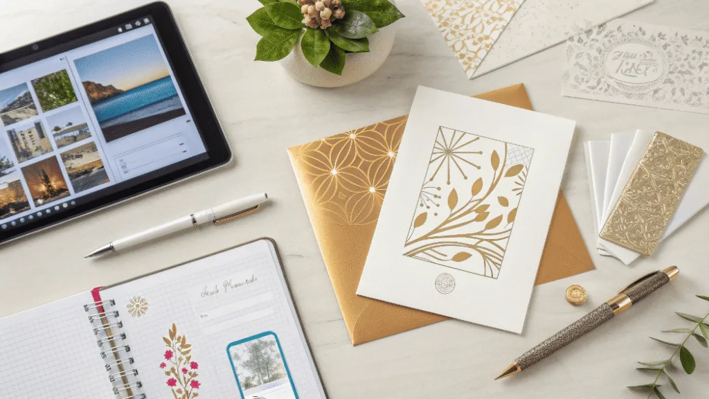
Sending generic cards? Worried they get tossed without a second thought? I’ll show you how to create cards that strengthen your brand and customer relationships.
Start with high-quality cardstock. Then, create a design that reflects your brand’s identity. Finally, add a personal message and consider professional finishes like embossing or foil stamping. This combination turns a simple card into a memorable keepsake that shows you truly care.

While that sounds straightforward, the difference between a homemade card and a professional one that represents your brand lies in the details. As a packaging expert, I’ve seen how the right materials and design choices can make a powerful impression. Whether it’s a holiday card for clients or a thank-you note included in an e-commerce order, every touchpoint matters. It’s a small piece of paper that carries a big message about your brand’s quality and attention to detail. Let’s break down how we approach this process to achieve a premium result.
What’s the Best Paper for a High-Quality Greeting Card?
Is your card flimsy and cheap-feeling? Worried that poor paper choice undermines your message? Let’s fix that by selecting a cardstock that screams quality and professionalism.
The best choice is a heavyweight cardstock, typically between 250-350 GSM (grams per square meter). Uncoated stock is great for a natural, writable feel, while coated stock makes colors and photos pop. Your choice should match your brand’s aesthetic and message.

The weight and finish of the paper are the first things a customer notices. It’s a tactile experience that sets the tone before they even read the message. At my company, Omet Packaging, we always guide our clients through this selection process. For a luxury jewelry brand sending thank-you notes, we might suggest a 350 GSM textured, uncoated cardstock. It feels substantial and elegant in the hand. For a vibrant apparel brand including a promotional card with online orders, a 300 GSM coated stock would be better to make the graphic design look sharp and bright. We source our paper from FSC-certified mills, which is a key selling point for our environmentally conscious clients. It shows they care about sustainability right from the first impression. The choice of paper is not just a technical detail; it’s a core part of your brand’s story.
| Paper Type | Common Weight (GSM) | Best For… | Feel & Appearance |
|---|---|---|---|
| Coated Stock | 250-350 | Photo-heavy designs, vibrant colors | Smooth, slight sheen (gloss or matte) |
| Uncoated Stock | 250-350 | Elegant, minimalist designs, easy to write on | Natural, textured, classic matte feel |
| Kraft Paper | 200-300 | Rustic, eco-friendly branding | Earthy, brown, raw texture |
| Textured/Linen | 300+ | Luxury brands, formal invitations | Premium, tactile, sophisticated |
How Do You Design a Card That People Actually Keep?
Afraid your business cards end up in the bin? Concerned your message isn’t landing? I’ll share design principles that get your cards noticed and cherished.
Focus on a strong visual hierarchy with a clear focal point. Use your brand’s colors and fonts consistently. Most importantly, combine a compelling design with a genuine, personalized message. A great card connects emotionally and provides value, whether through a heartfelt note or a special offer.

A great card design is a balance of art and communication. It needs to look good, but it also needs to serve a purpose. We learned this when working with a client in the gift industry. They wanted to include a "Happy Birthday" card with their gift boxes. Initially, their design was very busy, filled with logos and marketing copy. We worked with them to simplify it. We used their primary brand color as the background, placed their logo subtly on the back, and left the inside completely blank except for a simple "Happy Birthday" in an elegant font. This created more perceived value. It felt less like a marketing piece and more like a personal card the customer could actually use. This strategic use of "white space," or in this case, blank space, is crucial. It gives the message room to breathe and invites personalization.
Key Design Principles for Impact
- Visual Hierarchy1: Guide the reader’s eye. The most important element, like "Thank You" or a key image, should be the most prominent. Don’t make everything compete for attention.
- Brand Consistency2: Use your established brand fonts and color palette. This reinforces brand recognition across all touchpoints, from your packaging to your website to your cards.
- Emotional Connection: Use imagery or words that evoke an emotion. A simple, well-chosen photo or a sincere, hand-written-style message goes much further than cold corporate text.
What Professional Finishes Can Elevate Your Card?
Is your card looking a bit flat and ordinary? Want to add a touch of luxury that gets noticed? Explore professional printing finishes that make your card unforgettable.
Elevate a standard card with special finishes. Foil stamping adds metallic shine, embossing creates a raised 3D texture, and die-cutting can create unique shapes. These tactile details signal a premium brand and make the card feel like a special gift in itself.

This is where we take a card from good to incredible. At my manufacturing facility, which is BSCI-certified for ethical practices, these are the techniques my clients love. For a cosmetics brand, we might add a rose gold foil logo to their thank you cards. The way it catches the light immediately signals luxury and makes the customer feel valued. For a high-end food brand, we have used blind embossing (a raised texture without any ink) to create a subtle, sophisticated pattern on their holiday cards. It’s a detail you feel more than you see, and it speaks volumes about quality. Another powerful tool is die-cutting. Instead of a standard rectangle, we can cut the card into the shape of your logo or a seasonal item like a leaf for autumn. This instantly makes it stand out from the stack of mail. These printing techniques, which we also use for our premium packaging, require specialized machinery and expertise. They are an investment, but the return in brand perception is huge. They show you didn’t just send a card; you sent an experience.
Conclusion
Crafting a memorable greeting card involves thoughtful paper choice, strategic design, and premium finishes. Get these elements right to create a powerful, tangible connection with your customers.