Your current gift wrap feels generic and outdated. This disconnects your brand from modern customers who value style and sustainability, making your packaging forgettable. It’s time to embrace minimalist, authentic trends.
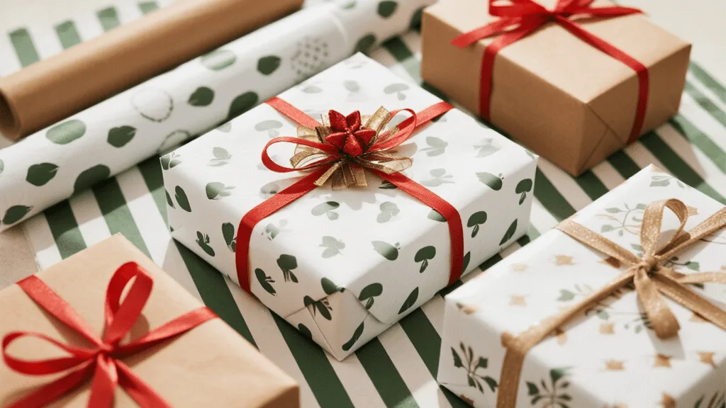
For 2025-2026, brands are embracing minimalist patterns, nature-inspired biophilic designs, and bold typography on white and kraft paper. This shift addresses the need for premium, sustainable aesthetics that create a memorable unboxing experience without appearing wasteful. We’ll explore these key trends in detail.
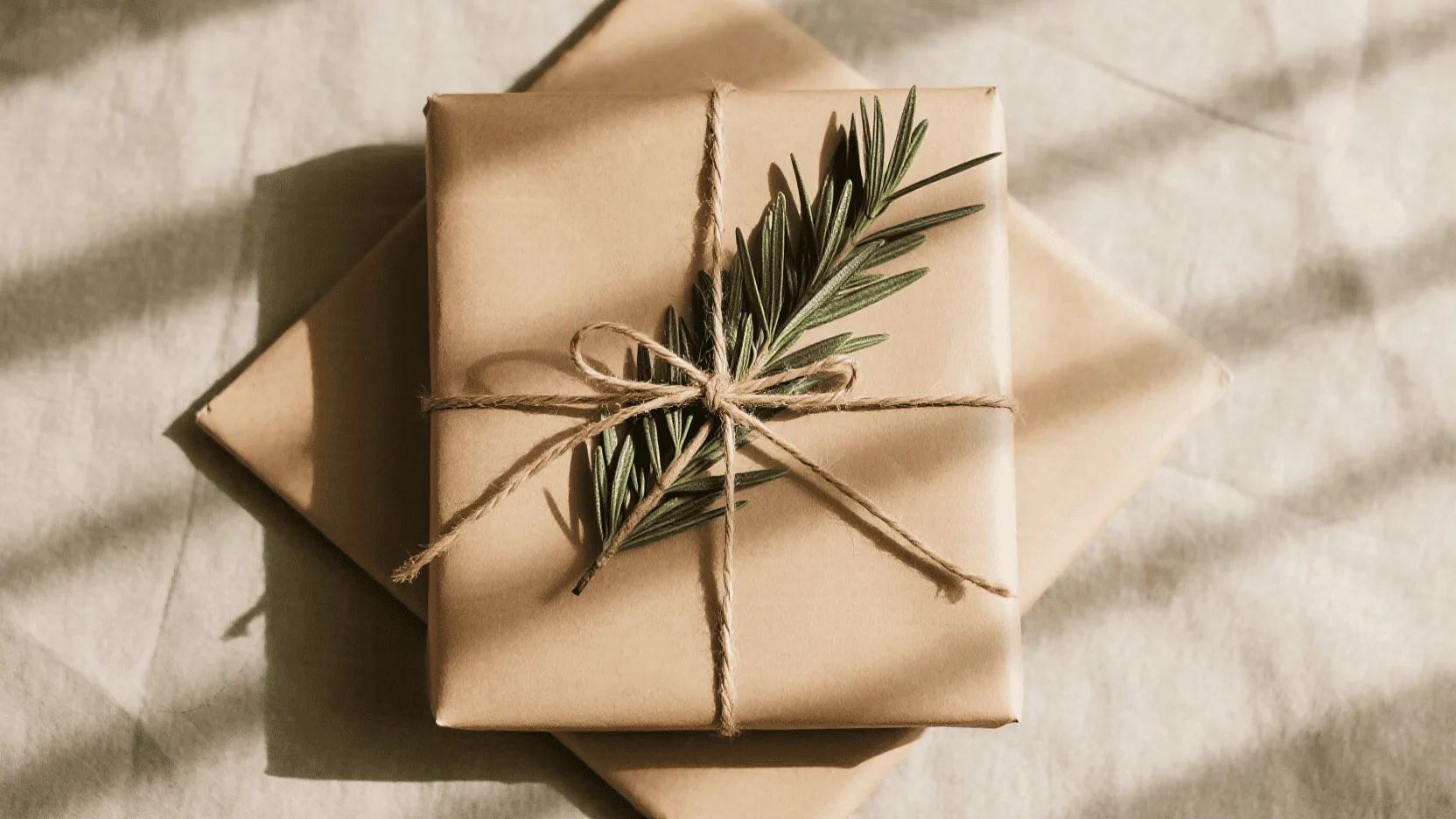
Last year, I met with the founder of a high-end organic skincare line. Her products were beautiful, but her gift wrap was a glossy, multi-colored explosion that felt completely disconnected from her brand. It screamed "mass-market," not "natural luxury." I laid out two options on her table: a sheet of our crisp white paper and a roll of our natural kraft paper. I explained that the future wasn’t about shouting with color, but whispering with texture and intent. That conversation sparked a total redesign of her packaging strategy, proving that the material you choose is the foundation of your brand’s gift-giving story.
How Is "Quiet Luxury" Influencing Minimalist Wrapping Paper Designs?
Your busy wrapping paper is cheapening your brand’s image. This visual clutter undermines the premium product inside, making the entire experience feel disjointed. Adopting a minimalist "quiet luxury" approach will restore sophistication.
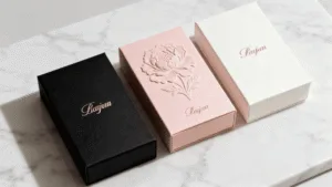
Brands are adopting "quiet luxury" by using expansive negative space, delicate line art, and discreet, repeating logos on both white and kraft paper. This minimalist approach communicates confidence and sophistication, shifting focus from the wrapping to the quality of the brand and the gift itself.
The "quiet luxury" trend is about substance over flash. It’s a move away from loud, ostentatious branding toward designs that feel confident and intentional. In packaging, this translates to minimalism. Instead of covering every inch with color and graphics, brands are using negative space as a design element. A simple, one-color print of a micro-pattern or a tastefully small logo on high-quality paper feels more exclusive than a full-bleed four-color design. For our clients, we often suggest a crisp black or metallic gold print on bright white paper for a timeless, high-fashion feel. On kraft paper, a simple white print creates a stunning, modern contrast. This approach is also more sustainable as it uses significantly less ink. The focus shifts to the quality and texture of the paper itself, elevating the entire unboxing experience. It tells the customer that the brand is so confident in its product that it doesn’t need to shout.
Minimalist Approaches on White vs. Kraft Paper
| Design Element | On White Paper | On Kraft Paper |
|---|---|---|
| Color Palette1 | Monochromatic (black, grey, or a single brand color) | Earthy and high-contrast (white, black, forest green) |
| Pattern Style | Geometric line art, micro-logos, pin dots | Organic shapes, subtle textures, single bold stripes |
| Overall Feel2 | Clean, architectural, modern, clinical luxury | Natural, artisanal, rustic-chic, authentic |
| Best Paired With | Satin ribbon, simple foil-stamped gift tags | Natural twine, fabric ribbon, custom-shaped paper tags |
Why Are Biophilic and Nature-Inspired Patterns Dominating Kraft Paper?
Your brand talks about sustainability, but your packaging doesn’t show it. This creates a trust gap with eco-conscious consumers who expect visual consistency. Nature-inspired designs on kraft paper instantly align your aesthetic with your message.
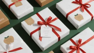
Nature-inspired, or biophilic, patterns are dominating kraft paper because they create an immediate visual link to sustainability and authenticity. These designs often feature delicate botanicals, abstract earthy textures, or simple leaf motifs, resonating with consumers’ growing desire for eco-conscious products.
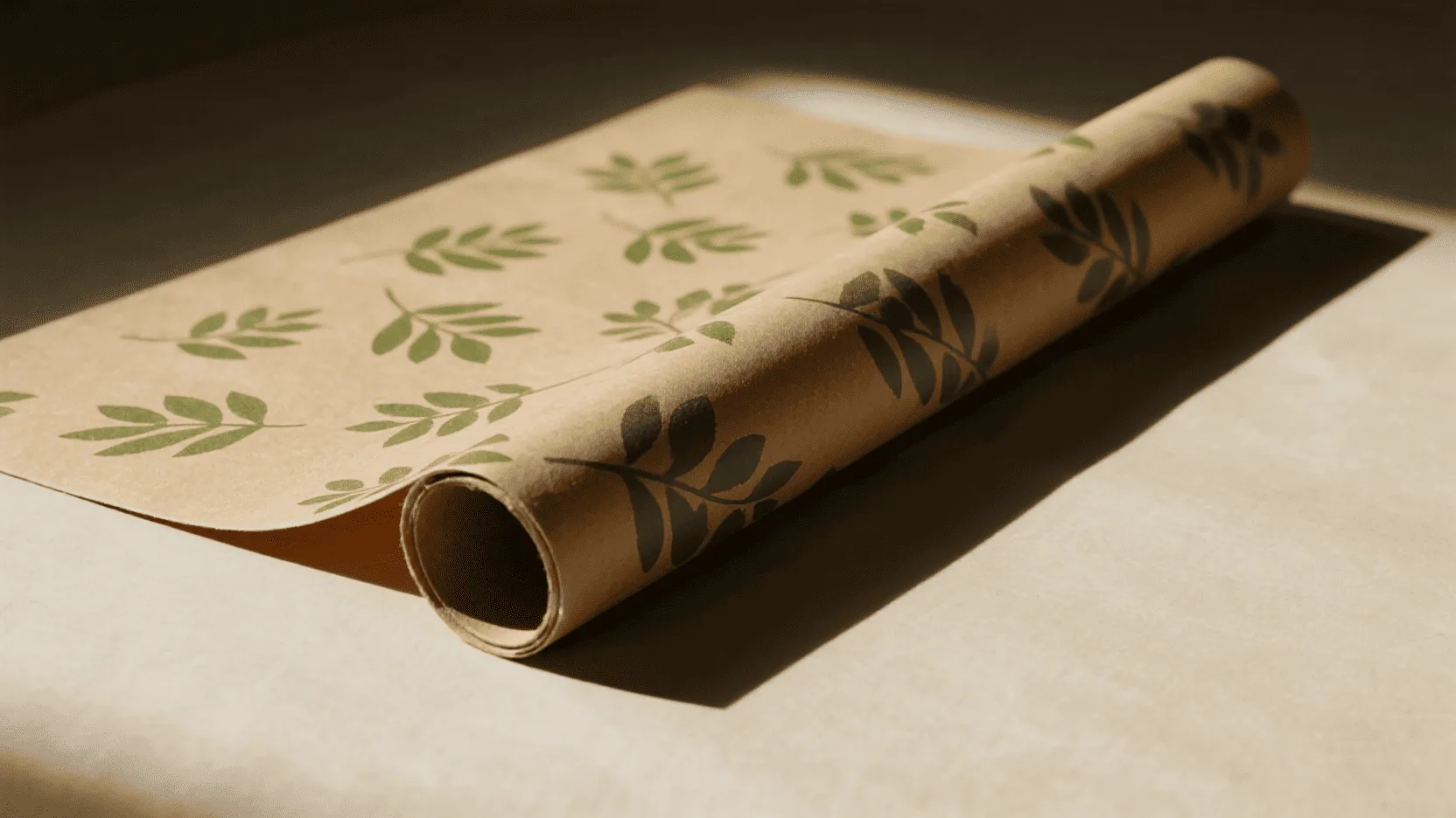
Biophilic design is the concept that humans have an innate need to connect with nature. This trend has exploded in interior design and is now a major force in packaging. It’s more than just printing a flower on a box; it’s about evoking the feeling of the natural world. Kraft paper, with its earthy, fibrous appearance, is the perfect canvas for this trend. It already feels organic and authentic. When we print a simple, elegant pattern of fern leaves, eucalyptus branches, or even abstract woodgrain textures onto it, the effect is powerful. It immediately tells the customer that this brand cares about the planet. A 2023 study highlighted that consumers are increasingly willing to pay more for sustainable products, and packaging is their first clue (McKinsey & Company). At Omet Packaging, we see a huge demand for this style, especially from brands in the wellness, food, and artisanal goods sectors. It’s an honest and beautiful way to make your gift wrapping paper an extension of your brand ethos.
How Are Brands Using Typography as the Main Design Element on Gift Wrap?
Your logo is just a tiny, forgotten element on your packaging. This is a massive missed opportunity to reinforce your brand identity during the unboxing experience. Turning typography into the primary design element makes your brand unforgettable.
Brands are transforming typography from a mere label into the main artistic feature. This involves using oversized brand names, custom fonts, or meaningful taglines in repeating patterns. This approach makes a bold, confident statement and reinforces brand identity directly within the wrapping itself.
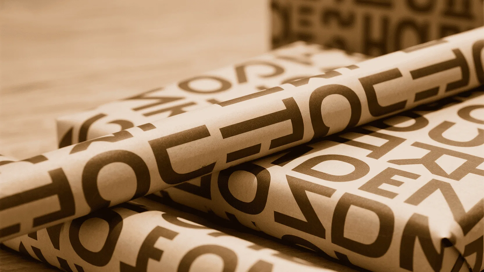
Think of your wrapping paper as a blank canvas for storytelling. What better way to tell your story than with your own words? This trend moves beyond simply putting a logo on paper and instead uses the letters and words themselves as the art. For a modern, direct-to-consumer brand, a bold, sans-serif font repeating the company name can feel energetic and confident. For a luxury brand, a custom script font featuring a tagline or brand value can create an elegant, bespoke wallpaper effect. I worked with a startup whose motto was "Crafted with Care." We turned that phrase into an elegant, repeating script on their paper bags and wrapping paper. It told their story before the customer even opened the box. On white paper, you have limitless color options, while on kraft paper, the contrast of black or white typography creates a timeless and graphic look. It’s a direct, effective, and stylish way to build brand recognition from the moment the customer receives their gift.
Conclusion
For 2025-2026, the strongest trends in gift wrapping are minimalism, nature-inspired patterns, and bold typography. These styles move beyond simple decoration to create a sophisticated and authentic brand experience, showing that thoughtful design is the ultimate luxury.
Ready to elevate your brand’s gift presentation? Contact us to discuss your custom wrapping paper.
FAQ
Can I still achieve a luxury feel with brown kraft paper?
Absolutely. The key to a luxury feel is not the color but the quality of the paper and the sophistication of the design. A thick-gauge kraft paper paired with a minimalist design, subtle embossing, or a high-contrast print (like crisp white or metallic gold) creates a modern, artisanal luxury that many consumers now prefer.
What are the most sustainable ink choices for custom printing?
Water-based and soy-based inks are the leading eco-friendly choices. They have significantly lower levels of volatile organic compounds (VOCs) than traditional petroleum-based inks and make the paper easier to recycle. We recommend them for all our sustainable packaging projects.
How important is it to have matching gift tags and cards?
Very important for a cohesive brand experience. When your gift tags and stickers and greeting cards carry the same design elements as your wrapping paper, it creates a complete, professional, and memorable presentation. It shows a level of detail and care that elevates your brand perception.