What Are the Gift Wrapping Paper Trends for 2026-2027?
Your current gift wrap feels generic and outdated. This disconnects your brand from modern customers who value style and sustainability, making your packaging forgettable. It’s time to embrace minimalist, authentic trends.
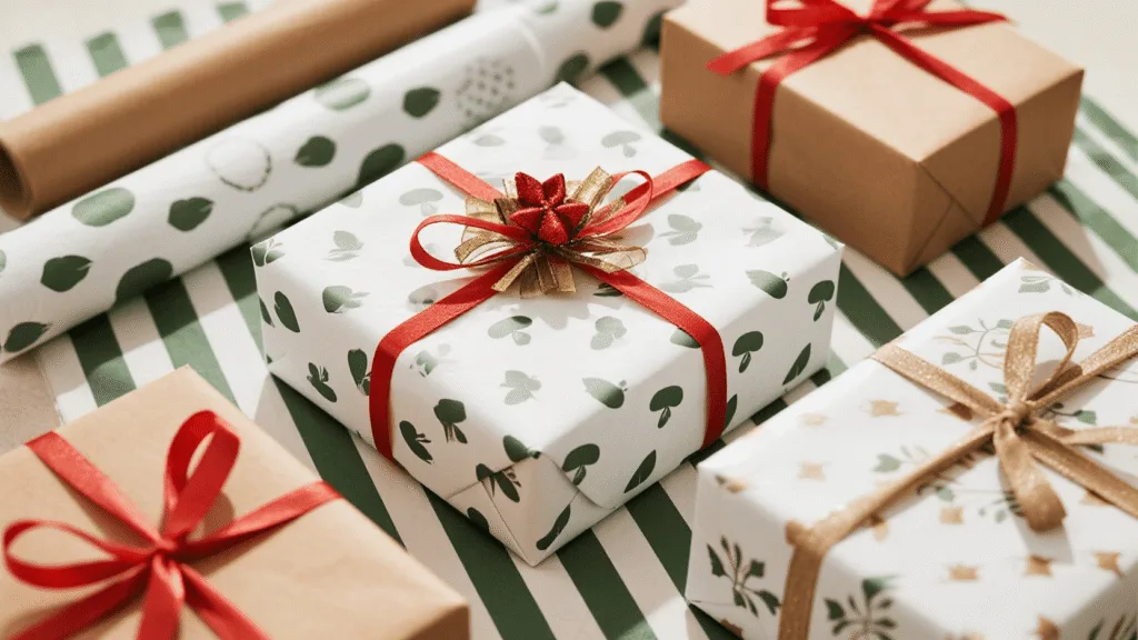
For 2026-2027, brands are embracing minimalist patterns, nature-inspired biophilic designs, bold typography, and refined tactile finishes on white and kraft paper. This shift addresses the need for premium, sustainable aesthetics that create a memorable unboxing experience without appearing wasteful. We’ll explore these key trends and techniques in detail.
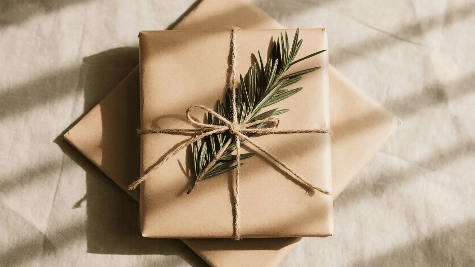
Last year, I met with the founder of a high-end organic skincare line. Her products were beautiful, but her gift wrap was a glossy, multi-colored explosion that felt completely disconnected from her brand. It screamed "mass-market," not "natural luxury." I laid out two options on her table: a sheet of our crisp white paper and a roll of our natural kraft paper. I explained that the future wasn’t about shouting with color, but whispering with texture and intent. That conversation sparked a total redesign of her packaging strategy, proving that the material you choose is the foundation of your brand’s gift-giving story.
How Is "Quiet Luxury" Influencing Minimalist Wrapping Paper Designs?
Your busy wrapping paper is cheapening your brand’s image. This visual clutter undermines the premium product inside, making the entire experience feel disjointed. Adopting a minimalist "quiet luxury" approach will restore sophistication.
Brands are adopting "quiet luxury" by using expansive negative space, delicate line art, discreet repeating logos, and subtle tactile details on both white and kraft paper. This minimalist approach communicates confidence and sophistication, shifting focus from the wrapping to the quality of the brand and the gift itself.
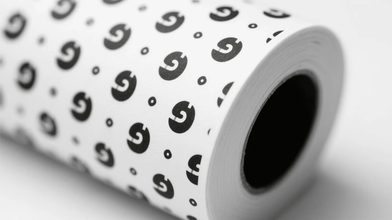
The "quiet luxury" trend is about substance over flash. It’s a move away from loud, ostentatious branding toward designs that feel confident and intentional. In packaging, this translates to minimalism. Instead of covering every inch with color and graphics, brands are using negative space as a design element. A simple, one-color print of a micro-pattern or a tastefully small logo on high-quality paper feels more exclusive than a full-bleed four-color design.
For our clients, we often suggest a crisp black or metallic gold print on bright white paper for a timeless, high-fashion feel. On kraft paper, a simple white print creates a stunning, modern contrast. This approach can also reduce ink usage compared with heavily printed designs, while putting greater emphasis on the quality and texture of the paper itself.
For brands using white kraft paper, however, minimalism does not have to mean plain. High-quality printing combined with carefully selected finishing techniques can add sophistication without overwhelming the design. A delicately embossed logo or a small foil-stamped brand mark can turn a simple sheet of paper into a premium sensory experience. The focus shifts from excessive decoration to the quality of the materials, printing, and craftsmanship.
Minimalist Approaches on White vs. Kraft Paper
| Design Element | On White Paper | On Kraft Paper |
|---|---|---|
| Color Palette1 | Monochromatic (black, grey, or a single brand color) | Earthy and high-contrast (white, black, forest green) |
| Pattern Style | Geometric line art, micro-logos, pin dots | Organic shapes, subtle textures, single bold stripes |
| Overall Feel | Clean, architectural, modern, clinical luxury | Natural, artisanal, rustic-chic, authentic |
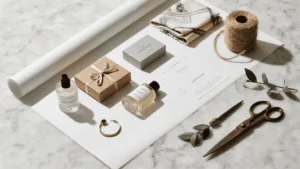
| Best Paired With | Satin ribbon, simple foil-stamped gift tags | Natural twine, fabric ribbon, custom-shaped paper tags |
| Premium Finishing | Embossing, debossing, metallic foil, subtle UV details | White foil, contrasting ink, natural textures, understated embossing |
Why Are Biophilic and Nature-Inspired Patterns Dominating Kraft Paper?
Your brand talks about sustainability, but your packaging doesn’t show it. This creates a trust gap with eco-conscious consumers who expect visual consistency. Nature-inspired designs on kraft paper instantly align your aesthetic with your message.
Nature-inspired, or biophilic, patterns are dominating kraft paper because they create an immediate visual link to sustainability and authenticity. These designs often feature delicate botanicals, abstract earthy textures, or simple leaf motifs, resonating with consumers’ growing desire for eco-conscious products.
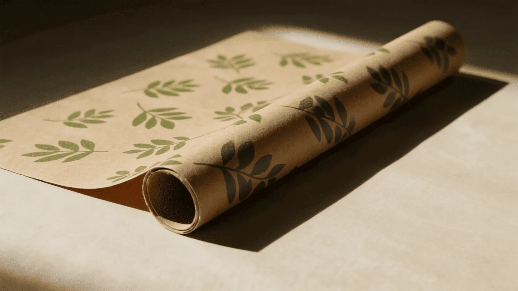
Biophilic design is the concept that humans have an innate need to connect with nature. This trend has exploded in interior design and is now a major force in packaging. It’s more than just printing a flower on a box; it’s about evoking the feeling of the natural world.
Kraft paper, with its earthy, fibrous appearance, is the perfect canvas for this trend. It already feels organic and authentic. When we print a simple, elegant pattern of fern leaves, eucalyptus branches, or even abstract woodgrain textures onto it, the effect is powerful. It immediately tells the customer that this brand cares about the planet.
The key is to avoid overworking the design. A restrained botanical pattern, a single organic illustration, or a subtle earthy texture can communicate more authenticity than a complicated full-color design. This makes the wrapping paper an extension of the brand ethos rather than simply another promotional surface.
How Are Brands Using Typography as the Main Design Element on Gift Wrap?
Your logo is just a tiny, forgotten element on your packaging. This is a massive missed opportunity to reinforce your brand identity during the unboxing experience. Turning typography into the primary design element makes your brand unforgettable.
Brands are transforming typography from a mere label into the main artistic feature. This involves using oversized brand names, custom fonts, or meaningful taglines in repeating patterns. This approach makes a bold, confident statement and reinforces brand identity directly within the wrapping itself.
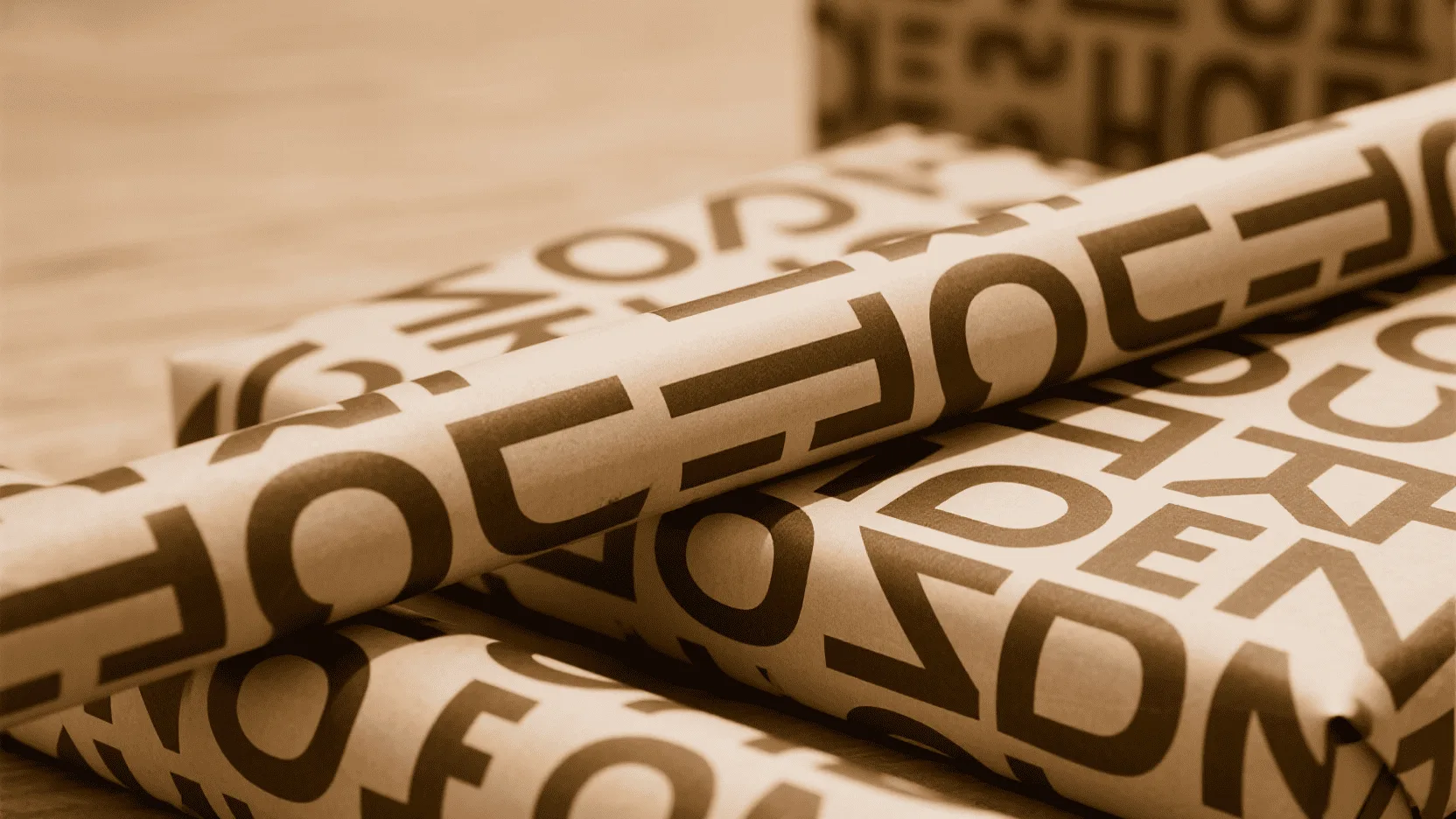
Think of your wrapping paper as a blank canvas for storytelling. What better way to tell your story than with your own words? This trend moves beyond simply putting a logo on paper and instead uses the letters and words themselves as the art.
For a modern, direct-to-consumer brand, a bold, sans-serif font repeating the company name can feel energetic and confident. For a luxury brand, a custom script font featuring a tagline or brand value can create an elegant, bespoke wallpaper effect.
On white paper, you have limitless color options, while on kraft paper, the contrast of black or white typography creates a timeless and graphic look. Typography can also be combined with restrained finishing details, such as a small foil-stamped logo or subtle embossing, to create a stronger hierarchy without making the design feel excessive.
Which Printing Method Offers the Best Quality for Detailed Designs on White Kraft Paper?
Your current gift wrap has blurry images and inconsistent colors. This poor print quality reflects badly on your brand, suggesting a lack of attention to detail. Choosing the right printing method is essential for a professional look.
Litho-offset printing delivers the highest quality for detailed graphics and precise color matching on white kraft paper. While flexography is cost-effective for large runs of simple patterns, litho-offset is the superior choice for brands that prioritize a sharp, premium print finish.
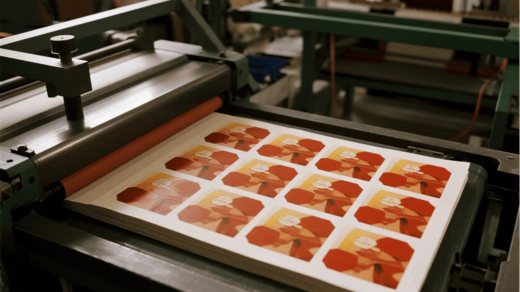
When it comes to printing on the smooth, bright surface of white kraft paper, you have a few excellent options, but the choice depends on your design’s complexity and your order volume.
Litho-offset printing is the gold standard for quality. It uses printing plates to transfer ink, resulting in incredibly sharp lines, rich color saturation, and consistent results across the entire print run. It’s ideal for intricate patterns, detailed graphics, or designs with subtle color gradients. The setup costs are higher, making it best for larger orders.
For simpler designs, such as a repeating one-color logo or basic pattern, flexography is an efficient and cost-effective alternative, especially for very large volumes. Digital printing is also an option for small, custom runs or prototypes because it requires no plate setup fees, although the cost per sheet is generally higher.
For brands looking to create a high-end impression on white kraft paper, litho-offset is often the strongest choice when the order volume and design complexity justify the investment.
Comparing Printing Techniques for White Kraft Paper
| Printing Method | Best For | Quality | Cost-Effectiveness |
|---|---|---|---|
| Litho-Offset | Detailed, multi-color graphics; premium branding | Highest Quality | Best for medium to large runs |
| Flexography | Simple, repeating patterns; very large runs | Good | Most cost-effective at high volumes |
| Digital Printing | Short runs, prototypes, variable data | Very Good | Best for very small quantities |
How Can Finishing Techniques Add a Premium Tactile Feel to Your Gift Wrap?
Your wrapping paper looks flat and feels generic. It lacks the memorable, sensory element that luxury customers expect. Incorporating tactile finishes will instantly elevate your packaging from a simple covering to a part of the gift itself.
Hot foil stamping and embossing/debossing are powerful techniques for adding premium visual and tactile appeal. Foil stamping adds metallic shine that catches the eye, while embossing creates a raised texture that invites touch. Together with the right printing method, these finishes can transform simple white or kraft paper into a sophisticated branding tool.
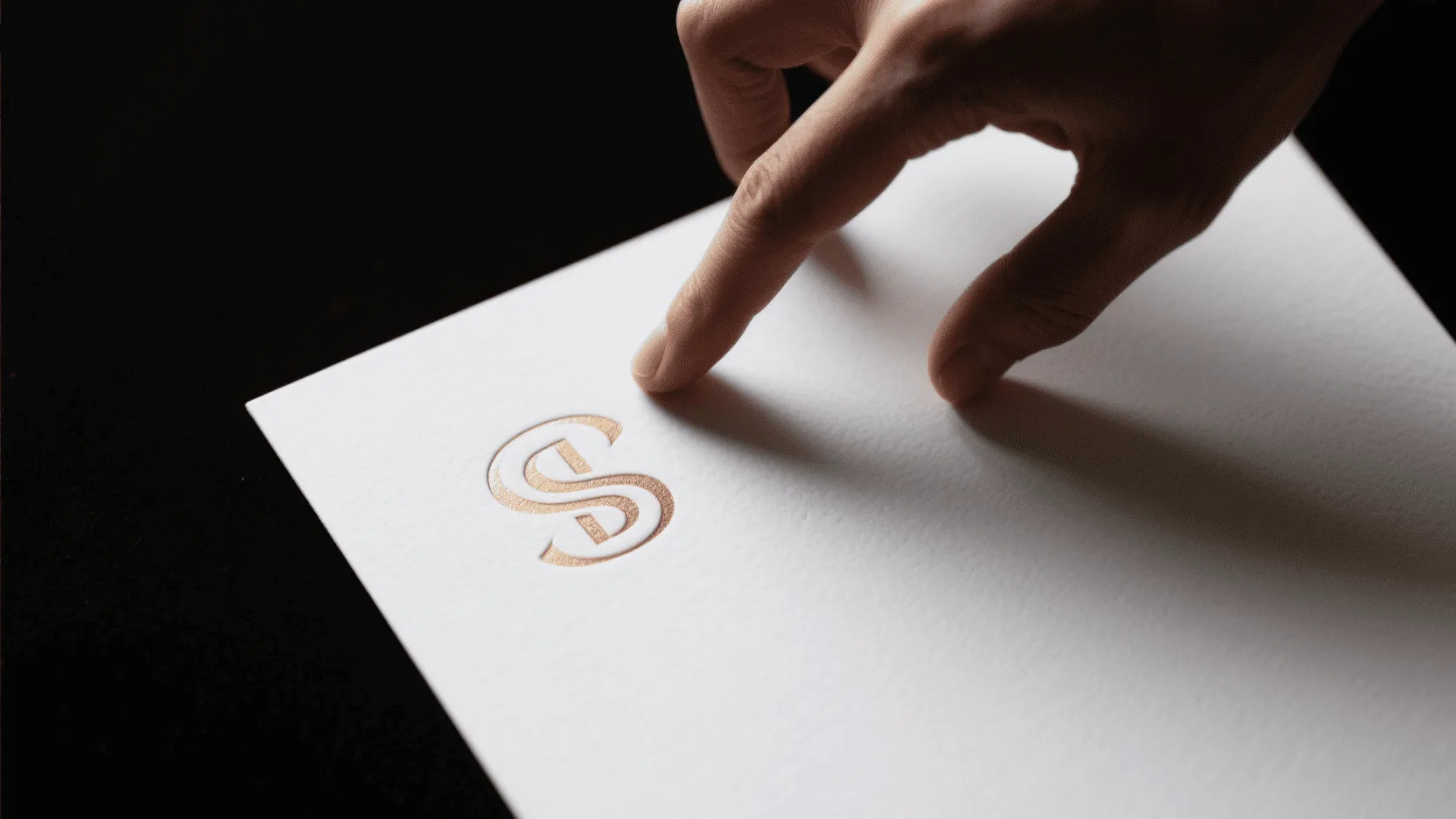
This is where we move from simply decorating paper to creating a sensory experience. A beautiful design is one thing, but when a customer can feel the quality, it builds a much deeper connection.
Hot foil stamping is a classic choice for a reason. The process uses heat and pressure to apply a thin layer of metallic foil—like gold, silver, copper, or even holographic effects—to the paper. The result is a crisp, brilliant finish that is difficult to replicate with standard ink. It instantly communicates luxury when used selectively.
Embossing and debossing are more subtle but equally powerful. Embossing raises a pattern or logo from the surface, while debossing creates a recessed impression. Both add a third dimension and encourage the customer to touch and interact with the packaging.
For white kraft paper, a delicately embossed logo combined with a small amount of metallic foil can be especially effective. It preserves the minimalist aesthetic while adding the sensory depth that plain printing may lack. This is the essence of "quiet luxury": the packaging feels premium because of its material and craftsmanship, not because it is overloaded with decoration.
What Are the Best Finishes for Durability and Visual Sheen?
Your beautifully printed paper smudges or scuffs during transit. This ruins the unboxing experience and makes your brand look careless. A protective finish is crucial to ensure your packaging arrives in perfect condition.
For durability, matte or gloss lamination offers strong protection against scuffs and moisture. For visual enhancement with sheen and some scuff resistance, UV coating is another effective option for premium gift wrap. For brands prioritizing sustainability, water-based varnishes can provide protection while maintaining a more paper-friendly approach.
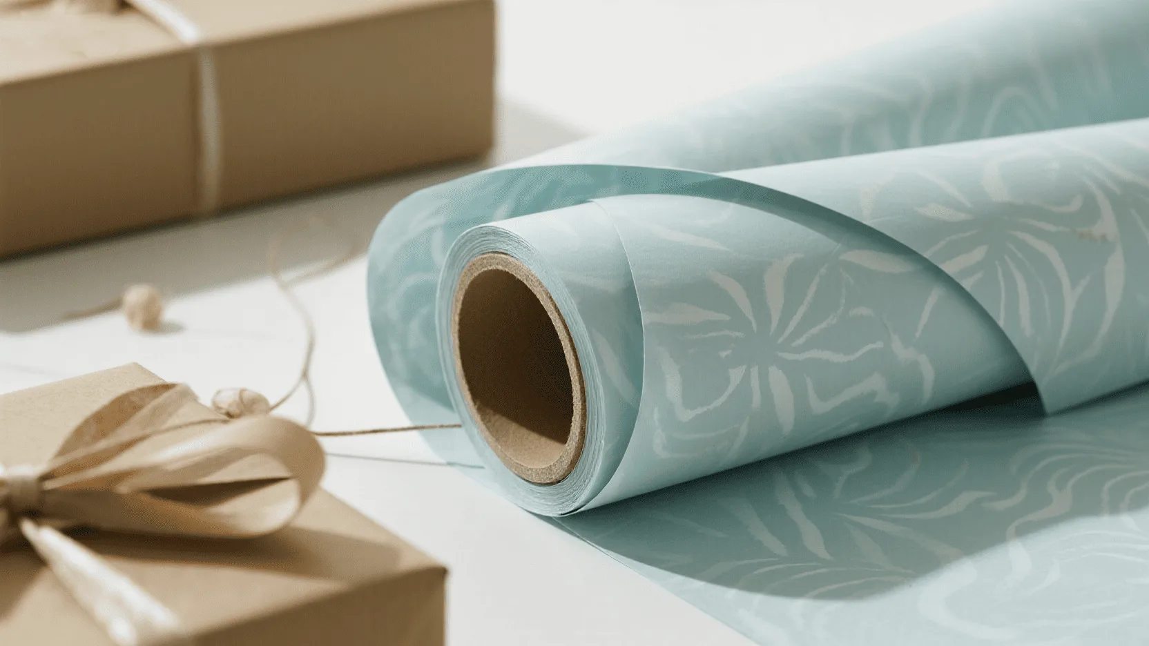
Once you’ve invested in high-quality printing, the last thing you want is for it to get damaged. This is where protective finishes come in.
A UV coating is a liquid varnish that is cured instantly with ultraviolet light. It can be applied across the entire sheet (flood UV) for a high-gloss look that makes colors pop, or it can be applied to specific areas (spot UV) to create a striking contrast between matte and shiny textures. It also provides a useful level of scuff resistance.
For maximum durability, especially for e-commerce brands where packaging endures a lot during shipping, lamination can provide additional protection. A gloss lamination gives a shiny, polished appearance, while a matte lamination provides a soft, elegant, non-reflective finish that feels very modern and luxurious.
However, protective finishing should be selected according to the brand’s sustainability goals. If recyclability and a paper-based packaging strategy are priorities, water-based varnishes can be considered as an alternative to plastic-film lamination. The right choice balances appearance, durability, application, and end-of-life considerations.
Conclusion
For 2026-2027, the strongest trends in gift wrapping are minimalism, nature-inspired patterns, bold typography, and thoughtful tactile finishing. These styles move beyond simple decoration to create a sophisticated and authentic brand experience.
The most effective approach is not to add more design elements, but to use better ones. High-quality white or kraft paper, precise printing, restrained typography, nature-inspired patterns, and selective finishes such as foil stamping or embossing can work together to create packaging that feels premium without appearing wasteful.
Ready to elevate your brand’s gift presentation? Contact us to discuss your custom wrapping paper.
FAQ
Can I still achieve a luxury feel with brown kraft paper?
Absolutely. The key to a luxury feel is not the color but the quality of the paper and the sophistication of the design. A thick-gauge kraft paper paired with a minimalist design, subtle embossing, or a high-contrast print such as crisp white or metallic gold creates a modern, artisanal luxury that many consumers now prefer.
What are the most sustainable ink choices for custom printing?
Water-based and soy-based inks are leading eco-conscious choices. They generally contain lower levels of volatile organic compounds (VOCs) than traditional petroleum-based inks and can support a more environmentally responsible packaging strategy. The appropriate ink should also be evaluated alongside the paper, coatings, and intended recycling process.
What is the difference between embossing and debossing?
Embossing creates a raised impression by pushing the design up from the back of the paper. Debossing is the opposite; it creates a recessed impression by stamping the design down from the front. Both add a sophisticated, tactile element to your wrapping paper.
Can I combine multiple finishing techniques on one design?
Yes, and this is often how the most impressive designs are made. A popular combination is to print a pattern with litho-offset, add a foil-stamped logo, and then use embossing or spot UV to highlight another element. The key is restraint: combining two or three complementary techniques can create a rich, multi-sensory experience without undermining the minimalist aesthetic.
How important is it to have matching gift tags and cards?
Very important for a cohesive brand experience. When your gift tags and stickers and greeting cards carry the same design elements as your wrapping paper, it creates a complete, professional, and memorable presentation. It shows a level of detail and care that elevates your brand perception.
-
Explore this link to discover effective color combinations that enhance minimalist designs on white paper. ↩